House Design by Diagram, from Palladio to Kahn - Part 2
Continued from Part 1

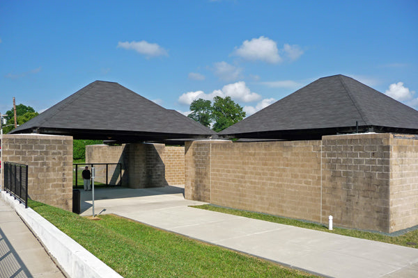
The Trenton Bath House’s services are positioned at the corners of each of its major spaces, echoing the four stairs surrounding the central hall of the Renaissance architect Andrea Palladio’s Villa Rotunda. The bath house’s plan also follows Palladio’s example in its basis in a diagram; in this case a “tartan grid,” as it’s become known to architects for its plaid appearance. Alternating 22-foot and 8-foot bands intersect to define large and small square spaces. The smaller spaces, highlighted above, contain toilets, storage rooms and U-shaped privacy passages leading to shower rooms.

An eight-foot square storage column in the background supports one of the bath house’s roofs at its corner. In the foreground, an eight-foot square U-turning privacy passage forms another hollow column.

Where the bath house’s hollow columns aren’t freestanding, they’re defined by vertical expansion joints and slightly raised 8-foot square concrete-slab caps. This allows the organizational logic of the building to be read and lets the columns contribute to its visual composition.

The bath house’s roofs float free between the hollow columns at their corners, expressing the liberation of the areas they serve.

Within the bath house’s privacy-screened shower pavilions, a primitive human relation to light, open air and nature is retained by sky openings around the perimeter of the roof and at its center. The absence of architectural detail and plainness of the concrete block, its crude joints deliberately struck flush, defer to this priority. The more self-effacing the surface upon which light falls, the more it seems to distill itself into its own primal mystery. The bath house’s architecture is less about itself than such fundamentals of nature and human experience, to which it reconnects the building’s users by removing distractions. This too recalls Palladio, whose villas were made of modest plastered brick, their power and luxury a matter of idealized form, not rich material. Kahn’s obsessive integration of services isn’t just a personality tic or a handy practical strategy; it’s a way to make a clearing for the wonder of existence to emerge. Kahn is renowned for his mastery of both the mundane and heavenly sides of this task.

Reproduced with permission of John Wiley & Sons Ltd.
Kahn was said by colleagues to have fixated on the illustration above, from Rudolf Wittkower’s 1949 book, Architectural Principles in the Age of Humanism (John Wiley & Sons). It shows schematized plans of Palladio Villas next to a diagram discerned by Wittkower to be their basis. Massaging the bay widths of the grid and selectively deleting line segments yields the various plans. The grid’s left-to-right bands alternate in width, allowing a complex mix of large and small spaces to emerge. Without divulging this secret recipe, Palladio described his intention in The Four Books of Architecture. As translated by Isaac Ware in his 1738 English edition, Palladio wrote:
Palladio’s idea of reciprocally used main and supporting spaces was echoed by Kahn in a 1961 interview:
Now when I did the . . . Trenton Bath House, I discovered a very simple thing. I discovered that certain spaces are very unimportant and some spaces are the real raison d’etre for doing what you’re doing. But the small spaces were contributing to the strength of the larger spaces. They were serving them.
Kahn’s concept of mutually defining served and servant spaces is his major contribution to architectural thought. This idea and its diagrammatic implementation had been there all along, but Kahn broke new ground in using them to deliver architecture’s historic monumentality and primitive power into our age of finicky programmatic demands and technological complications.

An interpretation of Rudolf Wittkower’s grid is here overlaid in yellow on Palladio’s 1560 Villa Foscari, “La Malcontenta,” as published in The Four Books of Architecture. The villa’s plan is formed by dropping out six of the grid’s line segments. Using the grid as a starting point, Palladio consistently produced villas made up of perfectly formed rooms of varying shapes and sizes, all meshing into a perfect whole. As the villa walls were all load-bearing, the pattern also automatically created a workable system of structural bays. The vaulted ceiling at the center of La Malcontenta illustrates his method’s marriage of structure and form. The pattern’s alternation of wide and narrow zones would be adopted by later architects to integrate modern services, as foreshadowed by Palladio’s use of it to unintrusively absorb stairs and storerooms.

Frank Lloyd Wright’s 1893-94 Winslow House compactly internalizes small service spaces for kitchen, pantry, stairs, driveway entrance and storage without compromising the integrity of its larger living spaces or the house as a whole.

The same grid pattern discovered by Wittkower in Palladio’s villas could be seen to organize the Winslow House plan, demonstrating the strategy’s adaptability to the machine age. Wright routinely used geometric patterns to absorb modern services within coherent house plans.

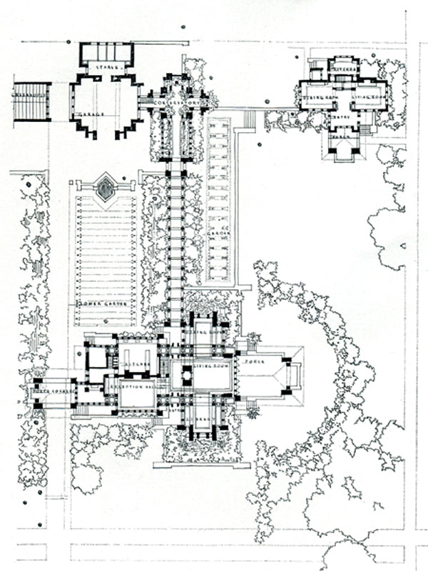
Wright later made extensive use of tartan grids to compose his much more complicated, magisterial Martin House complex.


Wright’s achievement can be appreciated by comparison to the design of “A Lake or River Villa for a Picturesque Site,” published 43 years earlier, in Andrew Jackson Downing’s 1850 house prototype book, The Architecture of Country Houses. The villa’s arrangement of perfectly shaped main rooms is achieved only by tacking on the messy services of kitchen, laundry and storage in an afterthought of a rear wing. This wing hides behind the house and, in the floor plan drawing, even sneaks off the page before fully revealing itself. The villa’s designer is clearly in denial about modern services and the compositional difficulty they present, so he exiles them from the major spaces they serve. Had he started from a Palladian grid or any other pattern accommodating large and small spaces, this might have been avoided. Instead of starting with a comprehensive diagram simultaneously arraying served and servant spaces, the villa’s designer planted spaces in sequence. He first arranged four full-sized rooms in a cruciform layout, then placed the stair tower in a notch to create a front façade of picturesque asymmetry, then realized there was no place for service spaces and hid them out back. A designer using this kind of sequential approach further limits his options with each successive decision. He favors the first functions to be placed and then progressively paints himself into a corner, forcing the last functions into arbitrary, leftover space. Today’s developer floor plans can somehow manage to look like entirely leftover space. It’s hard to point out any one thing that’s wrong with them; what they lack is what their designers lack; an architectural education.
This isn’t to say a good house can’t be designed without a diagram. Richard Neutra’s houses are free verse masterpieces. Neutra was a genius, though, and sculpted his designs around specific clients and sites. Prototype houses like Palladio’s villas aim for the universality of platonic ideals. They are embedded with ideas meant to apply anywhere, and to aid everyman. Louis I. Kahn has given these lessons new pertinence. Next, we’ll look at a house he designed, returning Palladio’s diagrammatic method to its original domestic realm.

0 comments